

Building a Winery That People Want to Collect
Project Summary
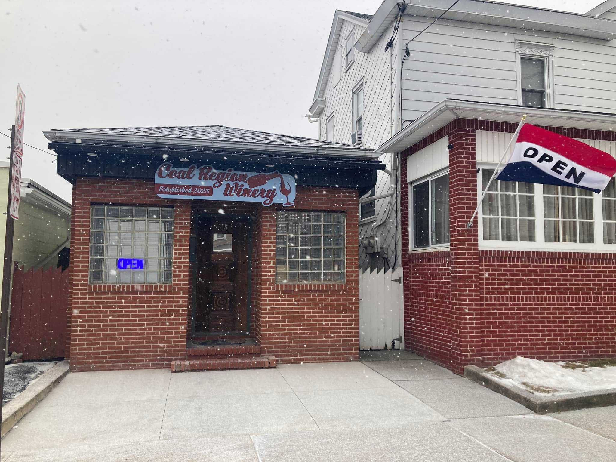
When Coal Region Winery was little more than an idea, the owner approached me with a vision: create a winery unlike anything else in the region. There was no existing logo, no established brand, and only a handful of rough ideas for wine names and potential characters.
Together, we built a visual identity designed to do something unusual in the wine industry—not communicate elegance or tradition, but spark curiosity and conversation. The goal was simple:
Create labels so memorable that people wanted to buy the bottle before they even tasted the wine.
Over the past three years, that vision has grown into a complete brand system spanning packaging, advertising, apparel, environmental graphics, social media, murals, and promotional campaigns.
The Challenge
Most wineries rely on familiar visual language—vineyards, script typography, crests, and understated labels.
Coal Region Winery wanted the opposite.
The challenge wasn’t simply creating attractive packaging. Every wine needed its own identity while still feeling unmistakably part of the same family. As new flavors were introduced over time, each label had to expand the brand without repeating previous ideas or diluting the overall personality.
Strategy
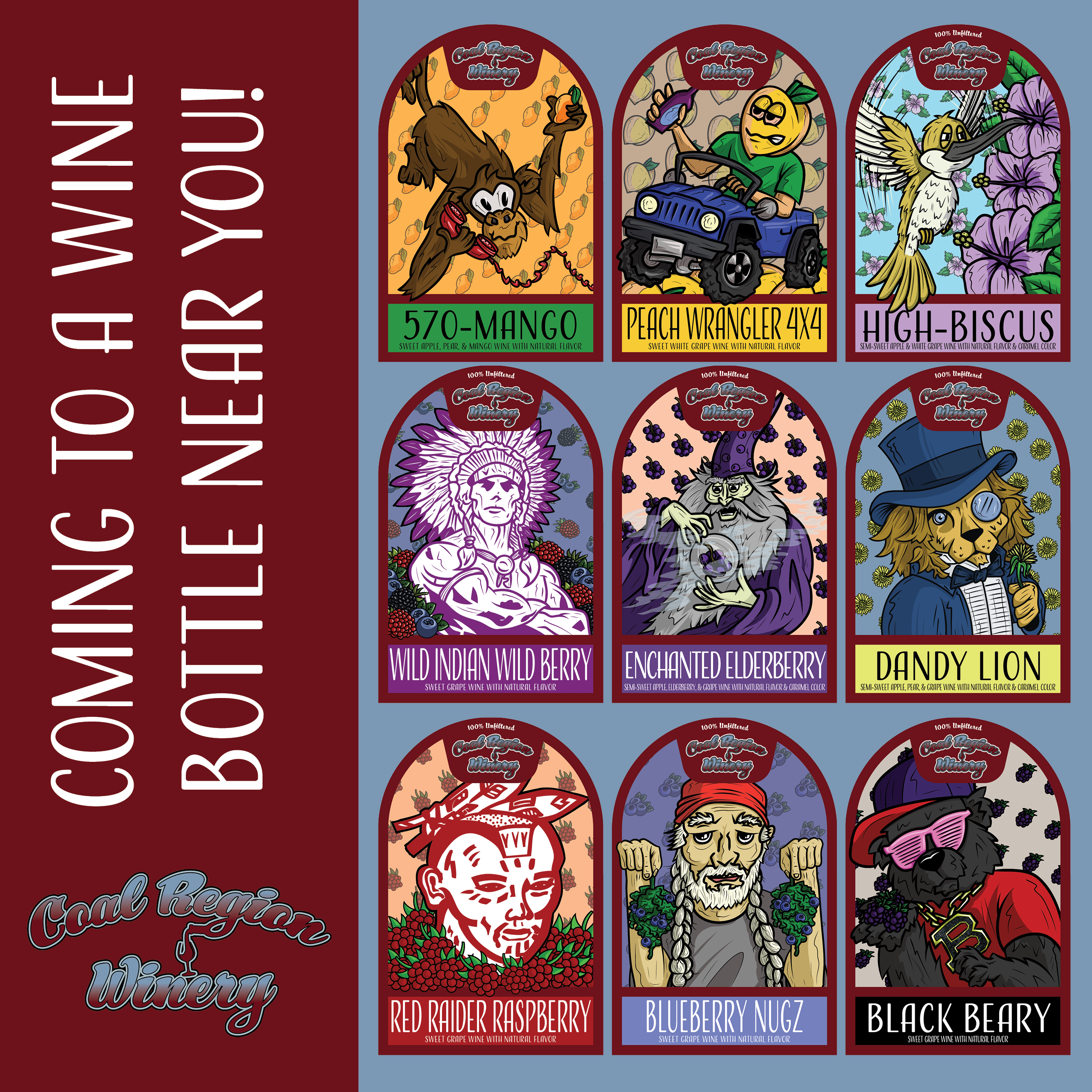
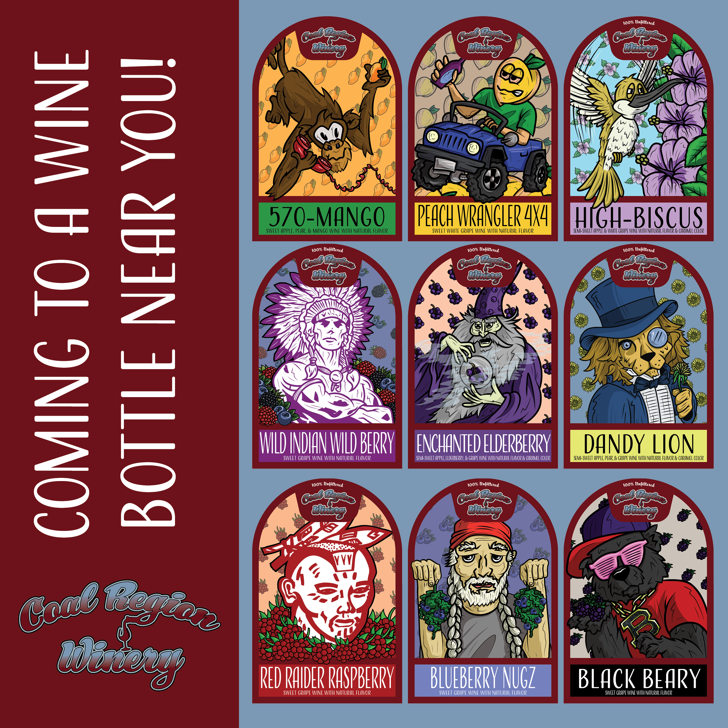
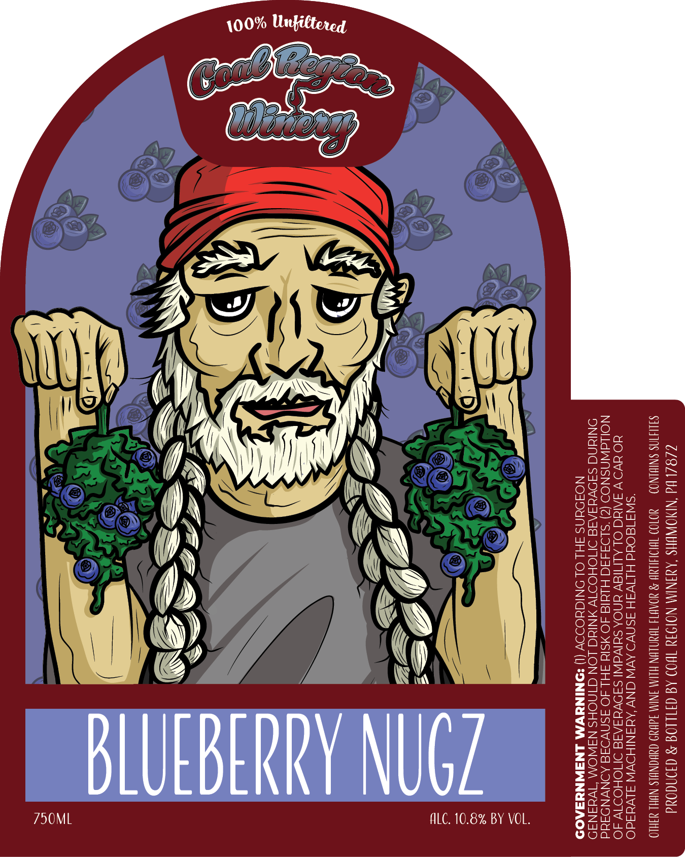
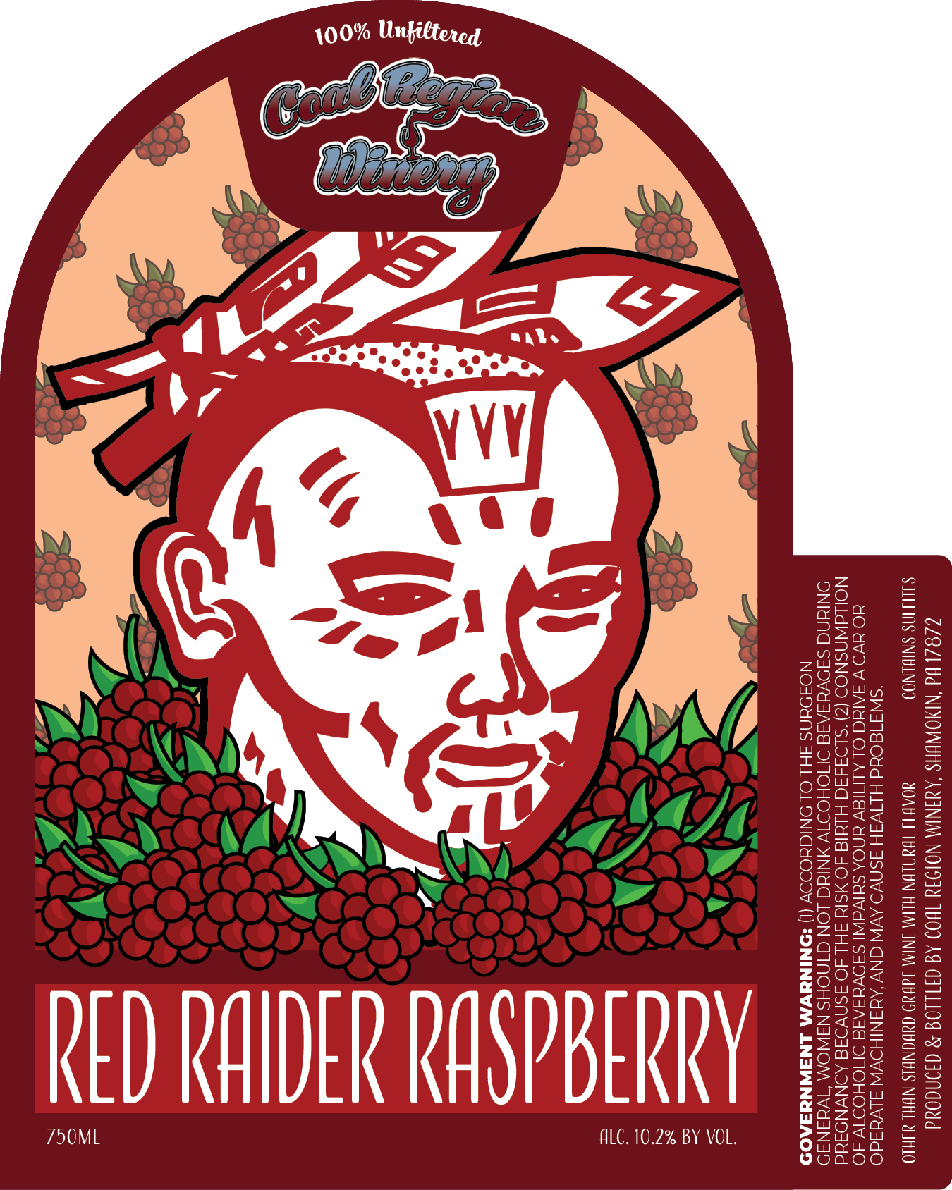
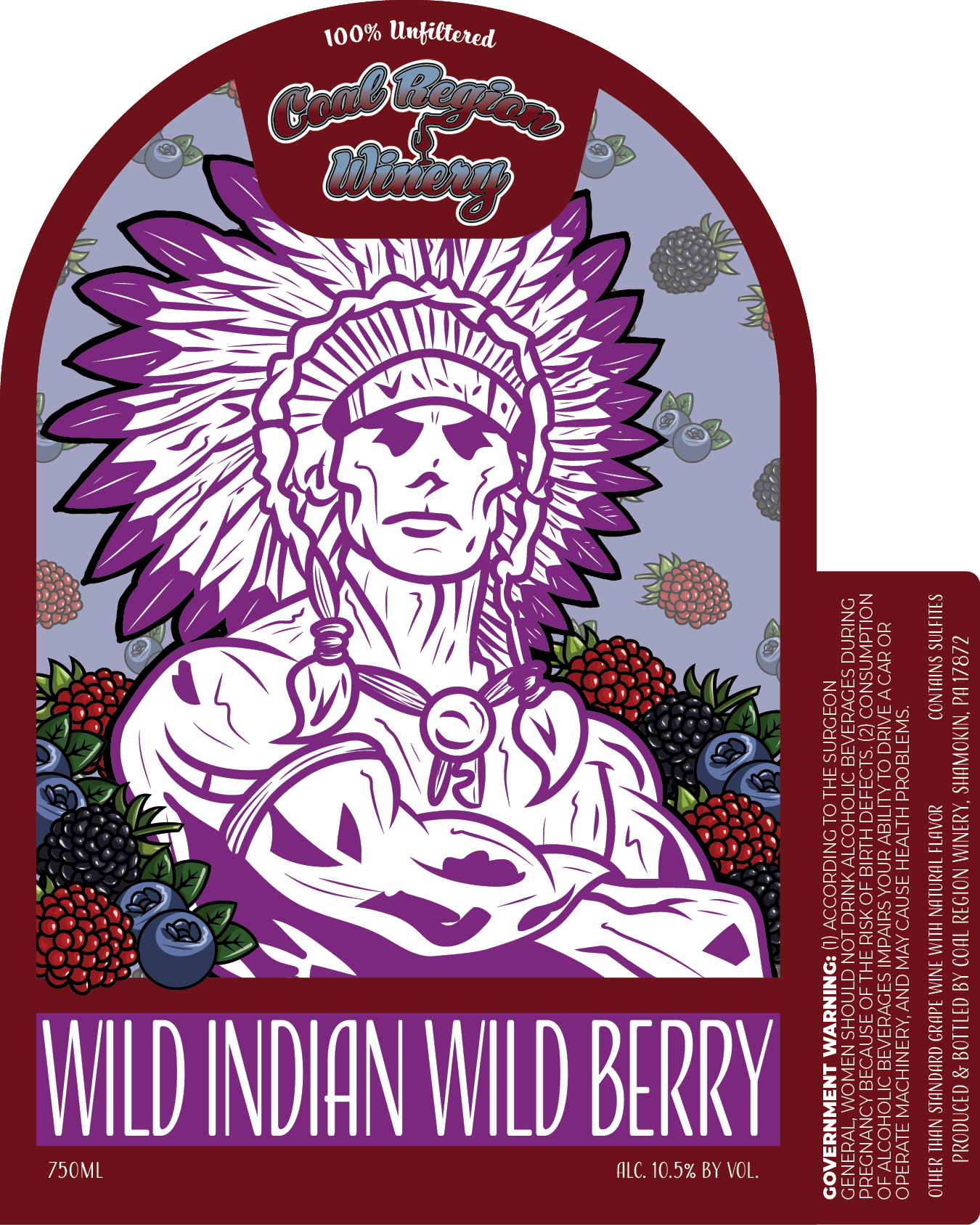
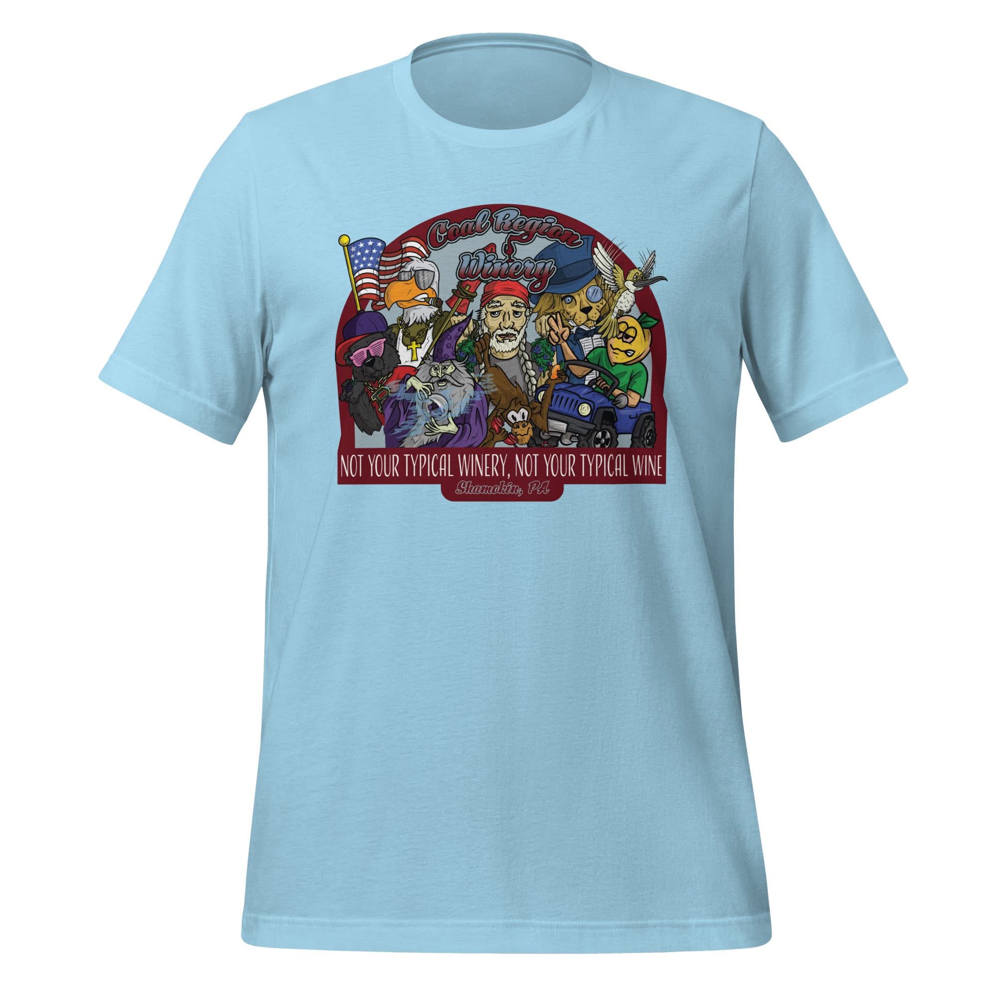
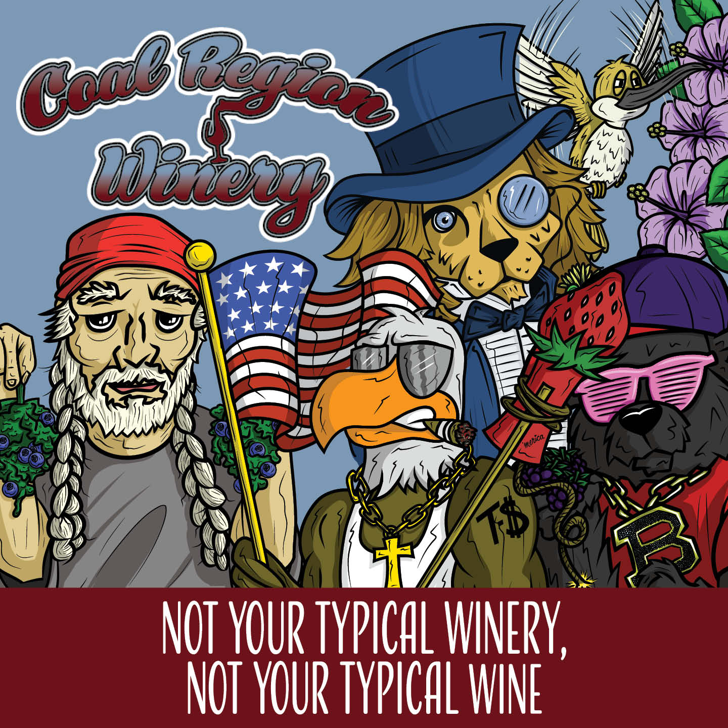
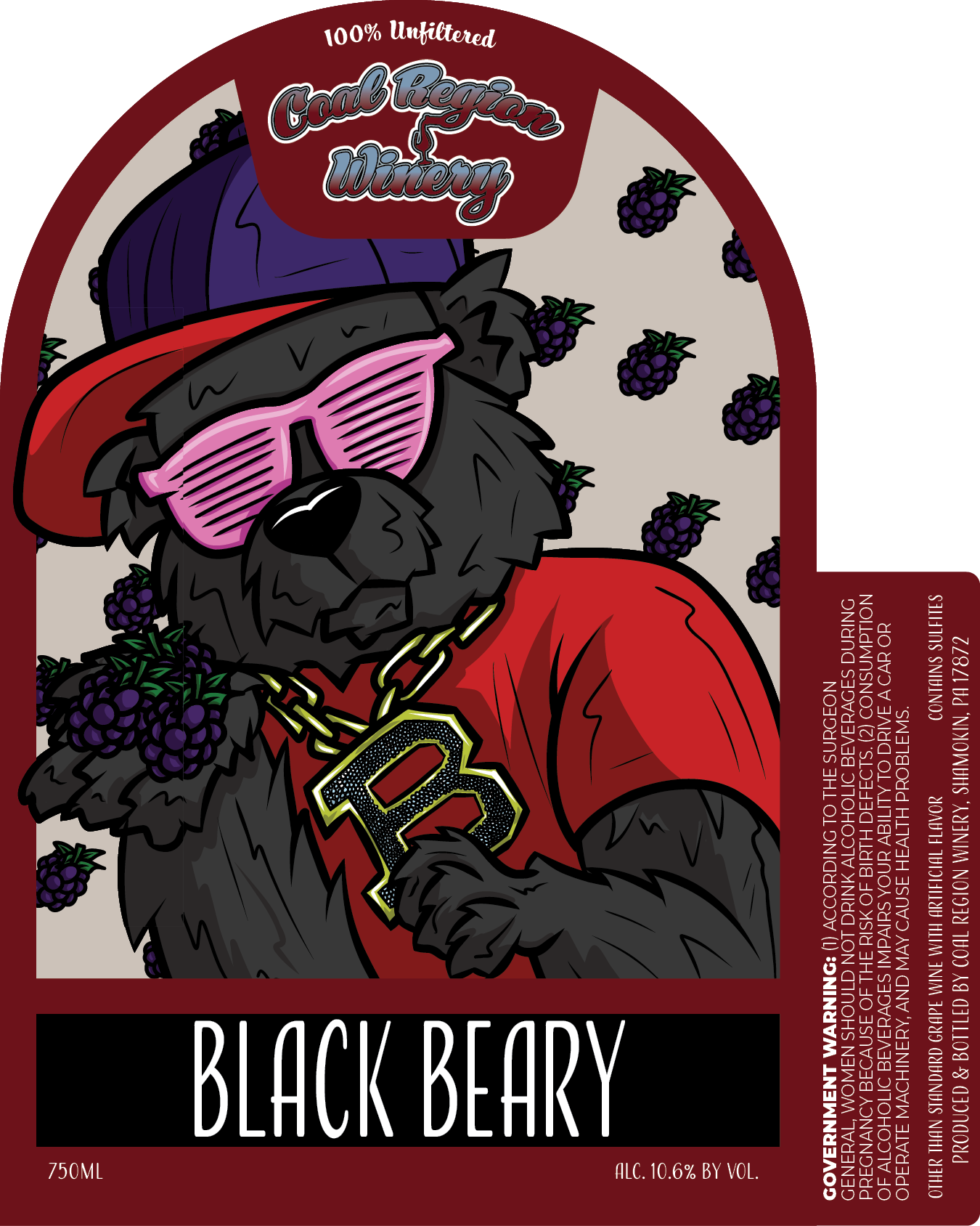
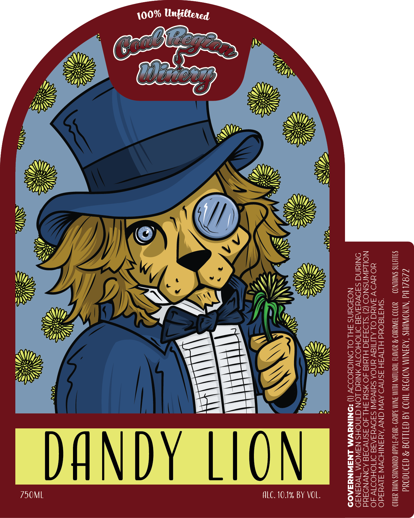
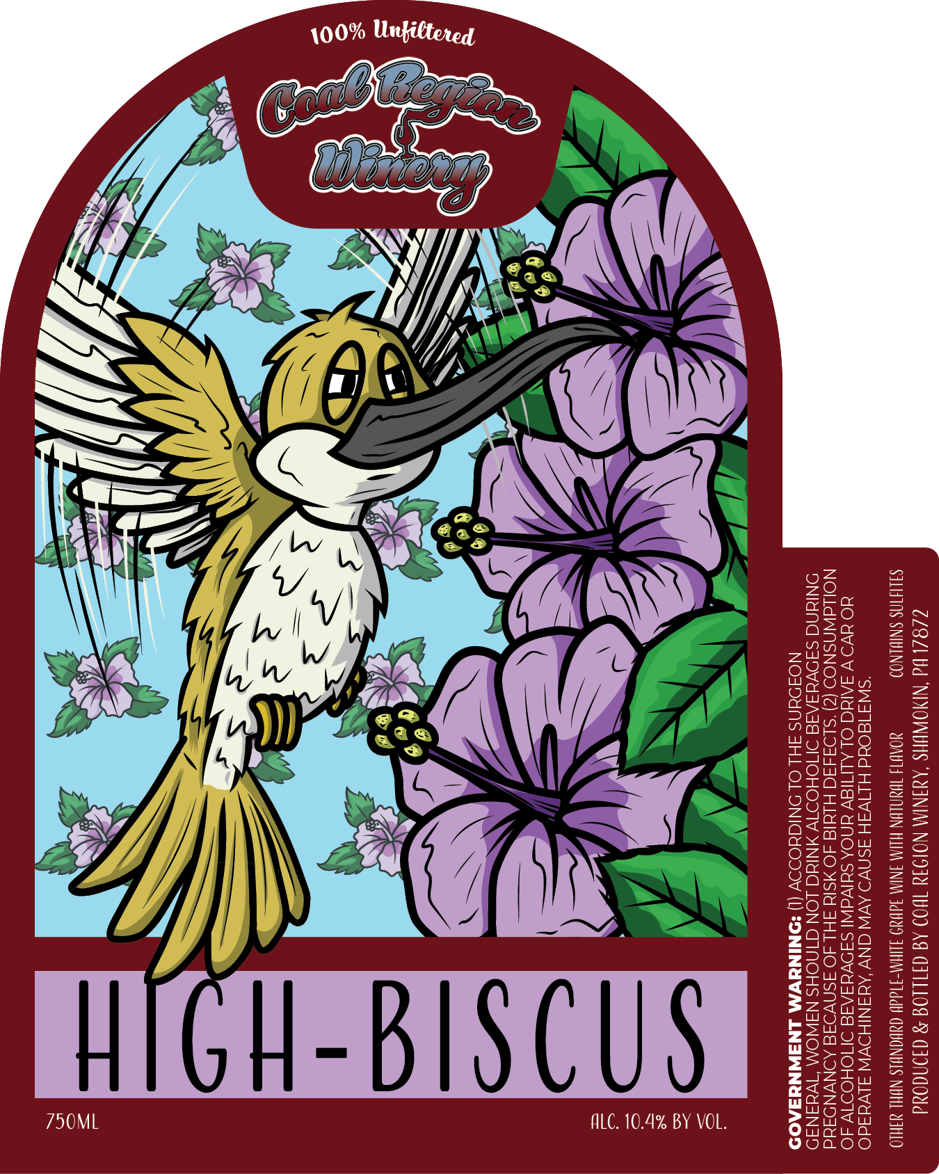
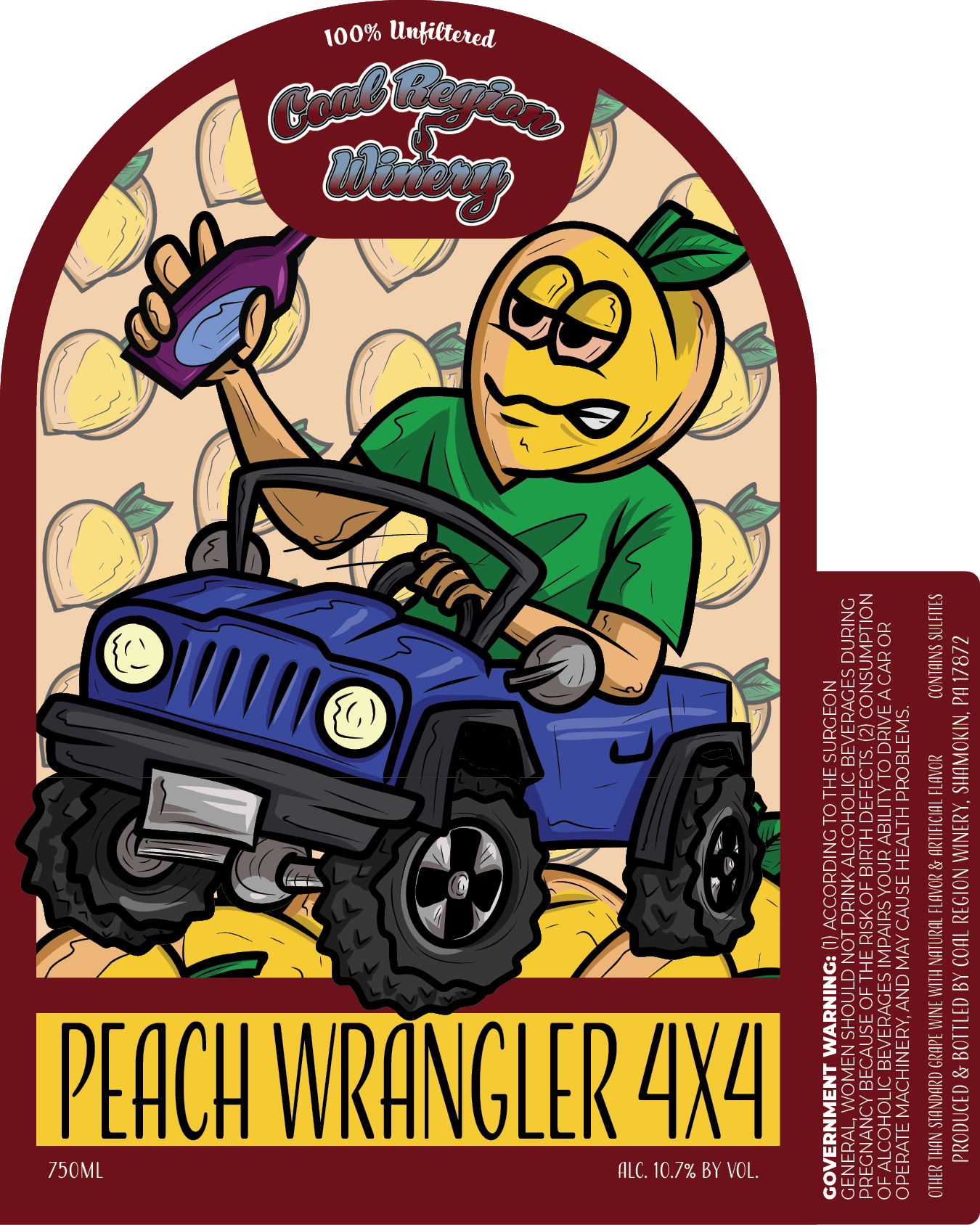
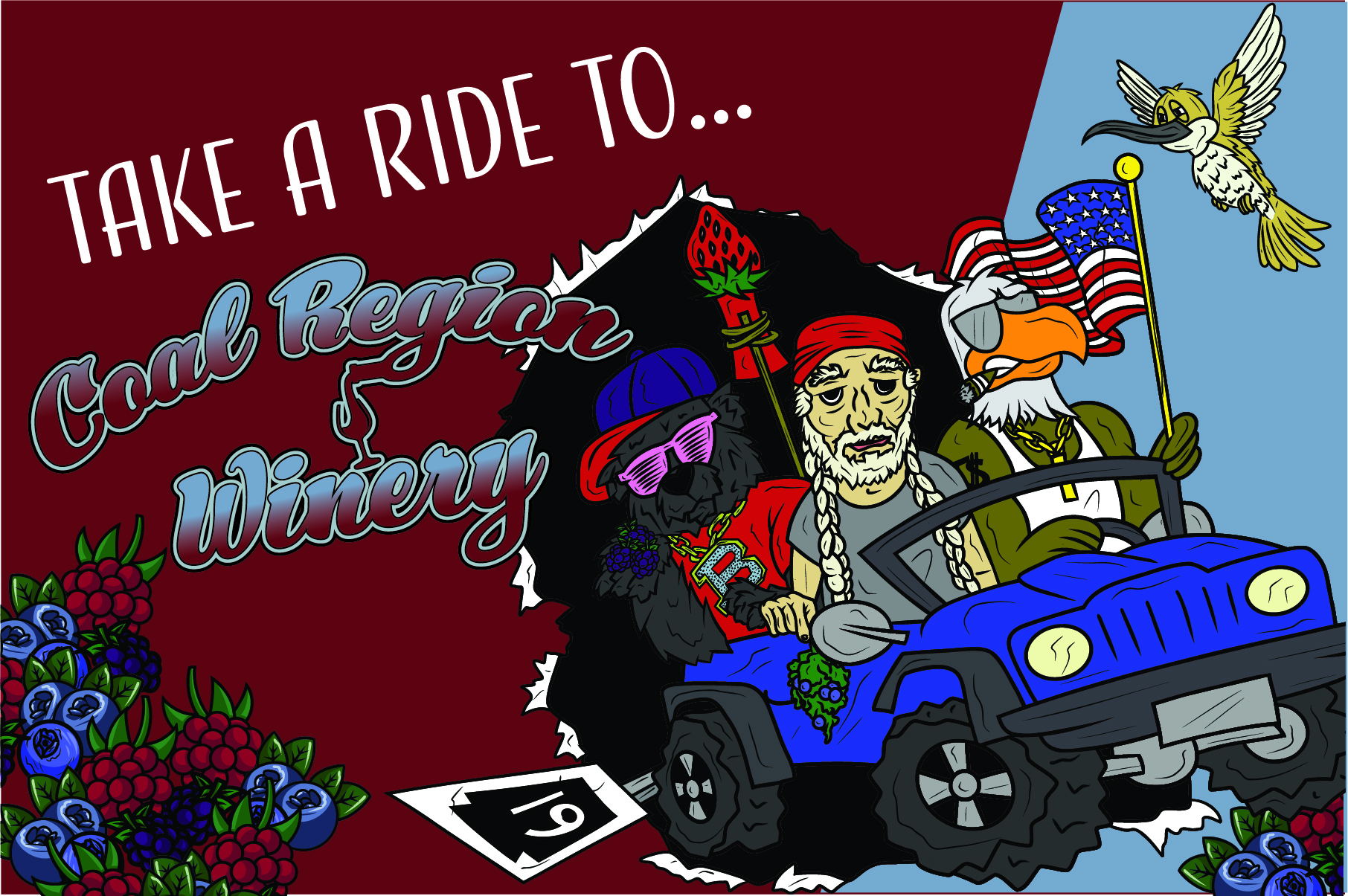
Rather than designing a collection of labels, I developed a cast of illustrated characters inspired by the Coal Region Winery’s culture, humor, history, and local personality.
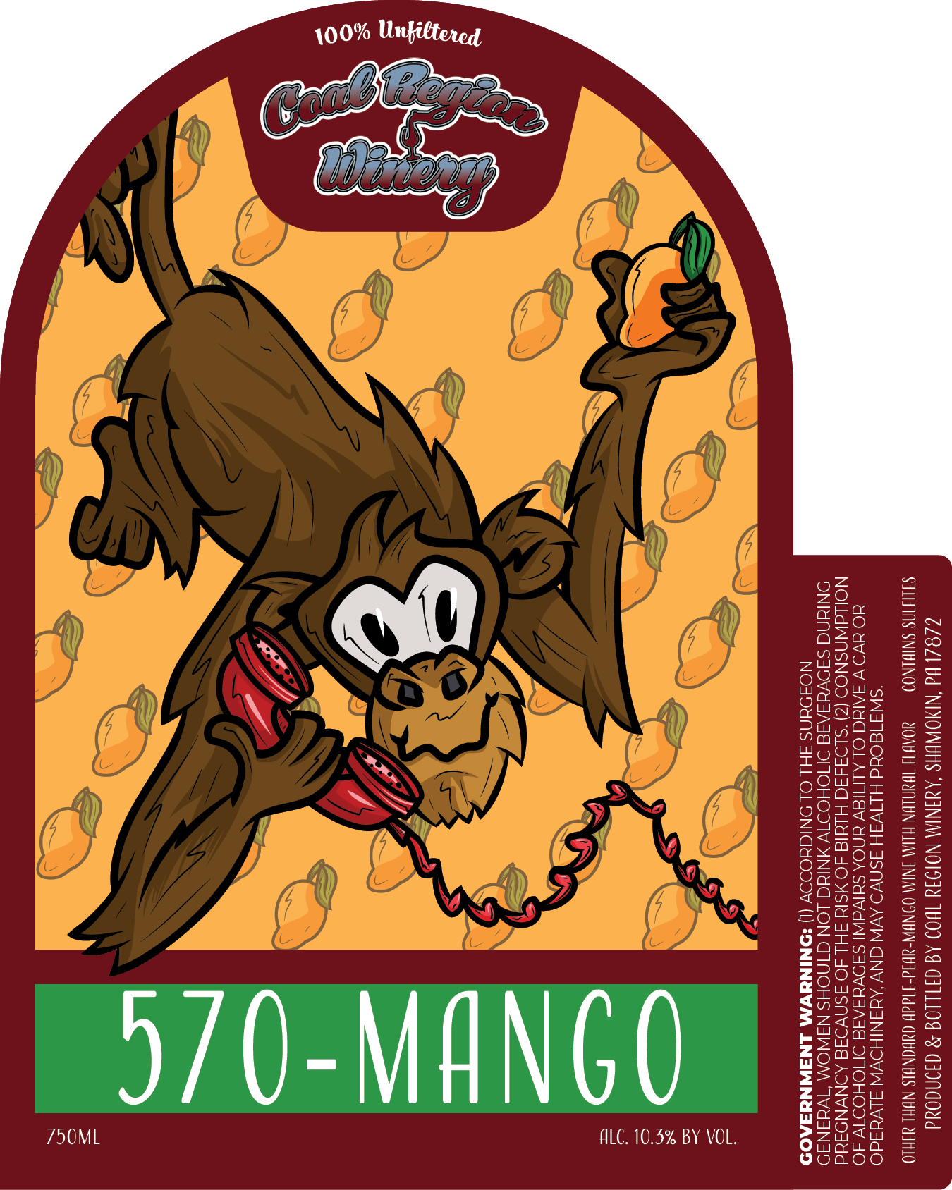
Each sweet wine became its own character.
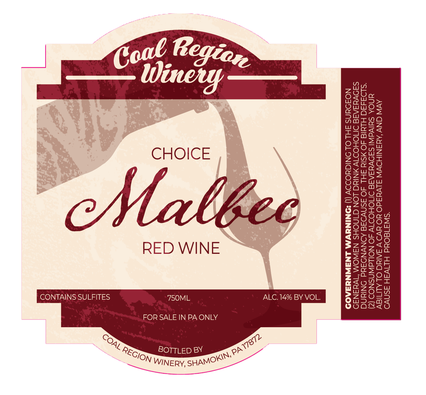
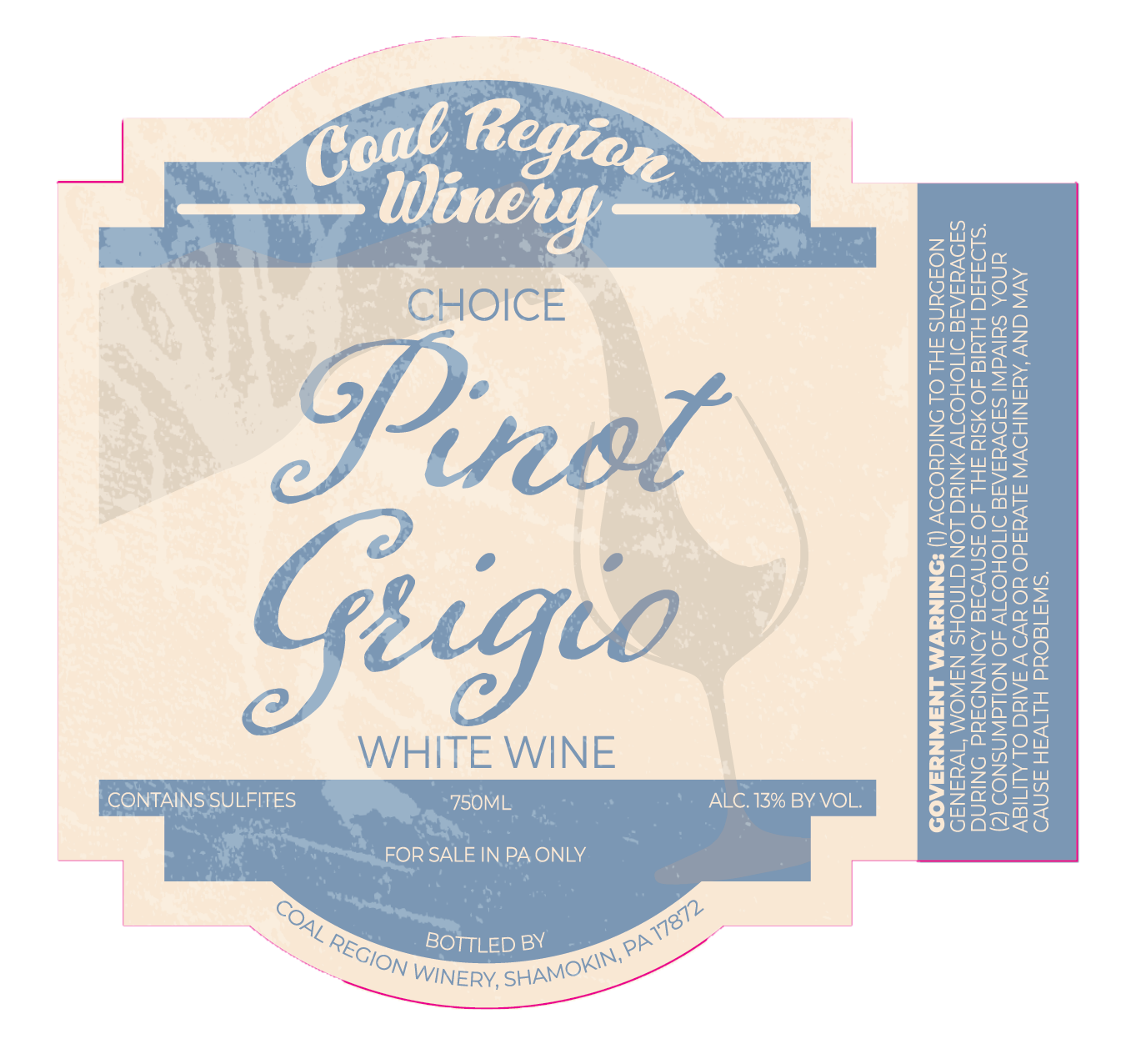
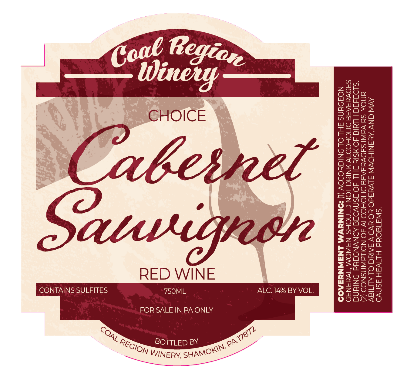
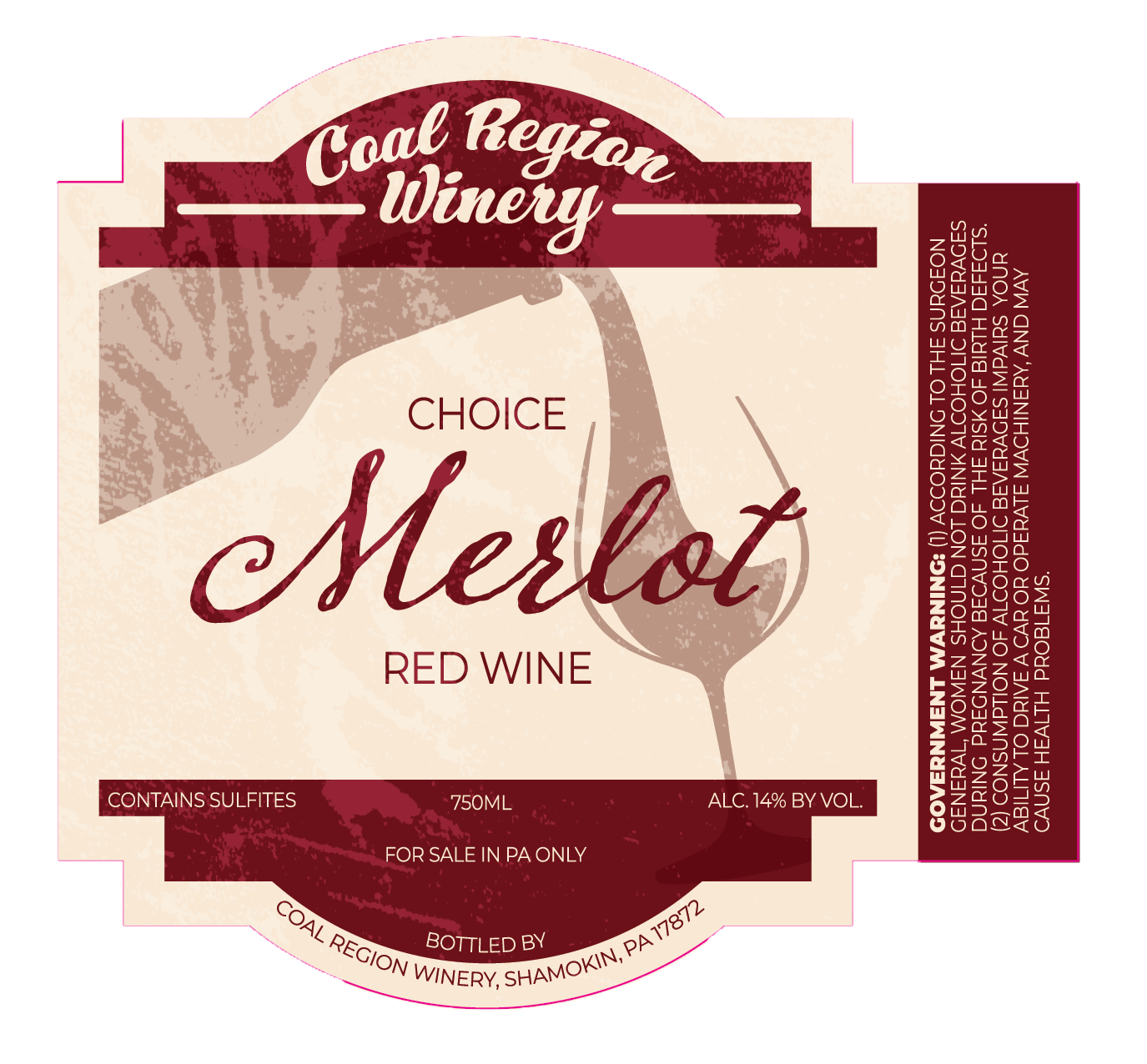
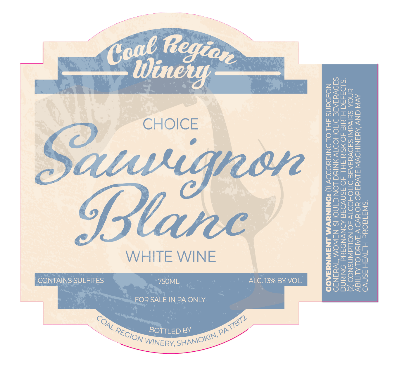
The dry wines followed a more refined visual direction, allowing them to feel appropriate on a restaurant table while remaining connected to the broader brand.
This dual approach allowed the winery to appeal to different audiences without sacrificing consistency.
Process
The project began with only a few rough concepts from the client.
After completing the first two illustrated labels, it became clear that the characters could become something much larger than individual products.
From that point forward, each new wine became an opportunity to expand the world surrounding the brand while maintaining a recognizable illustration style, typography, color system, and packaging structure.
As the winery introduced new products, I continued developing new characters and promotional artwork, ensuring every addition strengthened the overall identity rather than feeling disconnected.
Building The Brand
Over the course of our partnership, the work expanded far beyond wine labels.
Deliverables included:
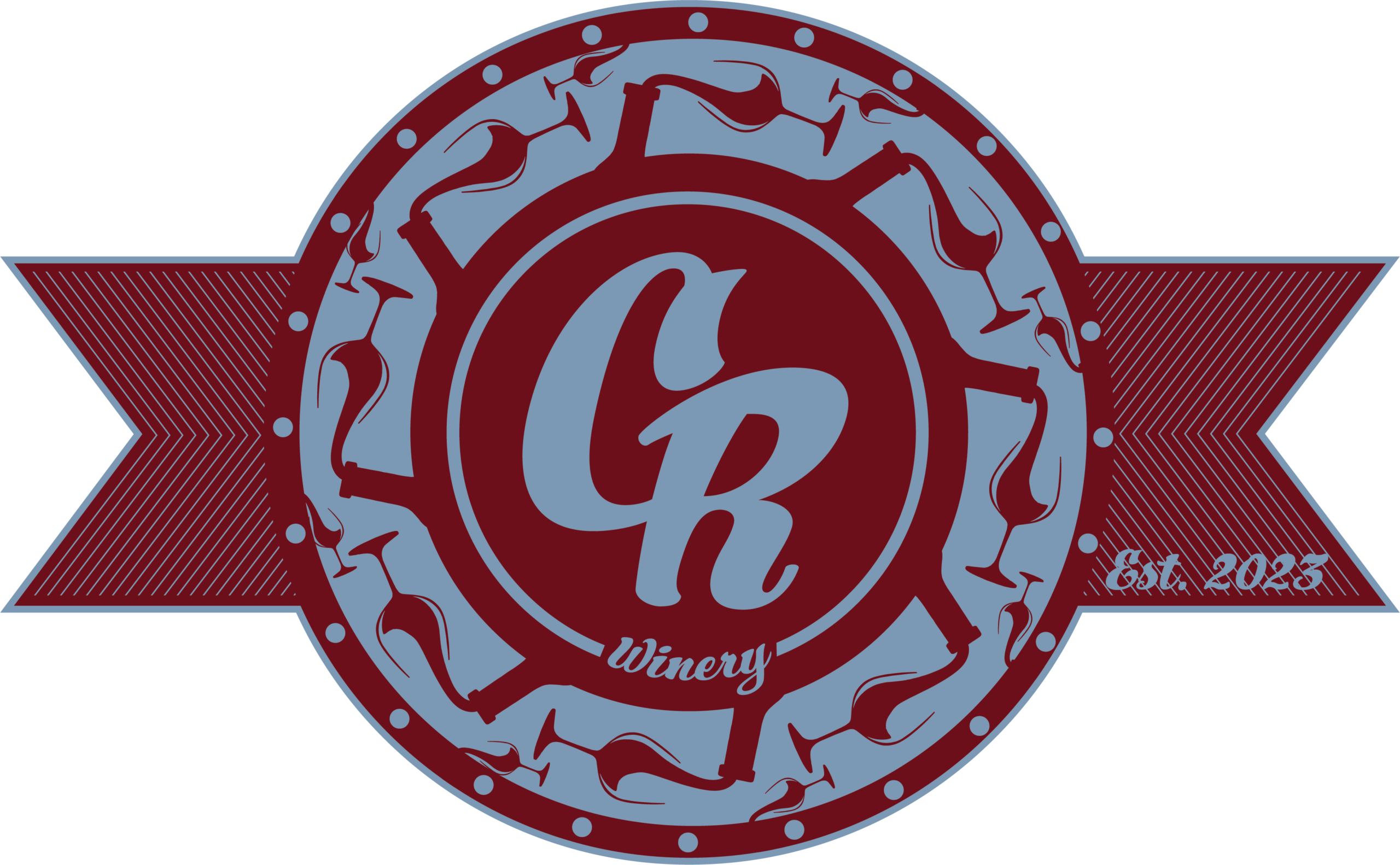
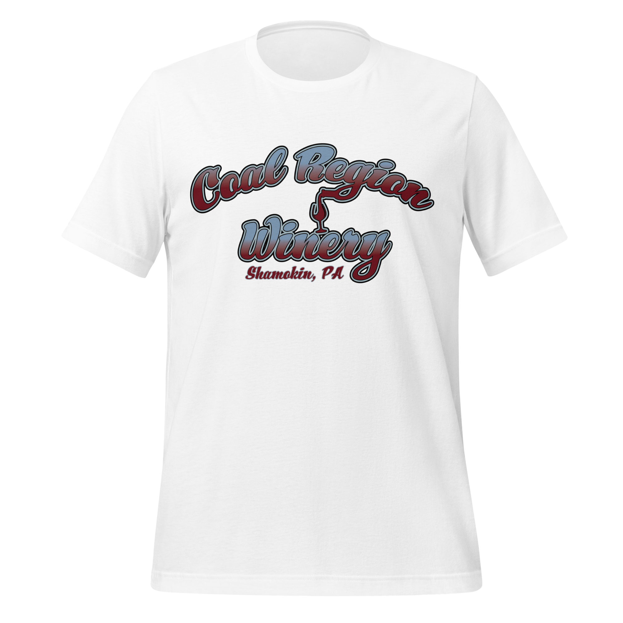
- Brand identity and logo
- Secondary monogram
- Illustrated wine label system
- Dry wine collection
- Seasonal and limited edition labels
- 250th Anniversary Fore Founder’s Reserve campaign
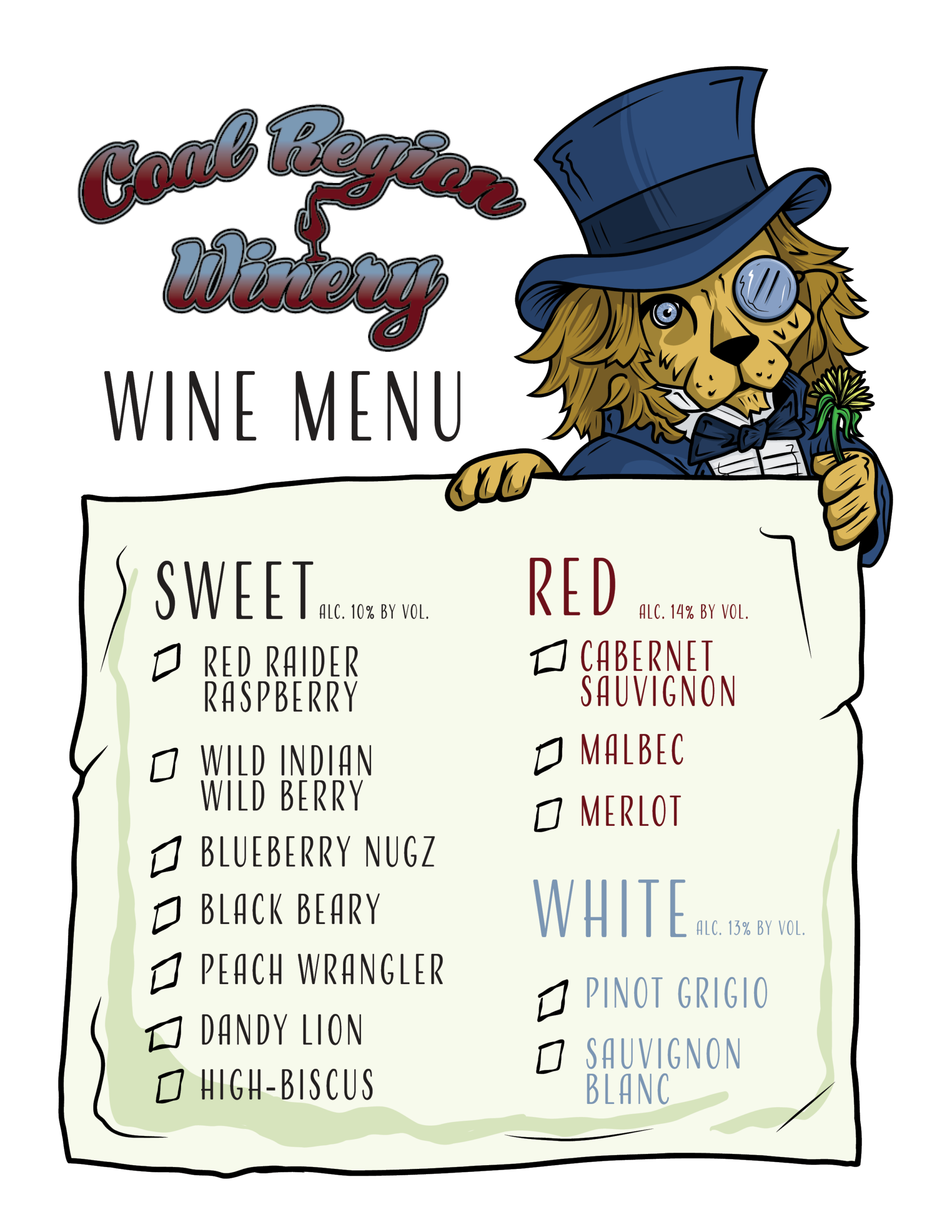
- Menus
- Social media graphics
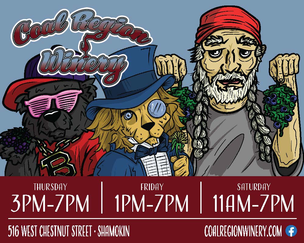
- Advertising campaigns
- Sports banners
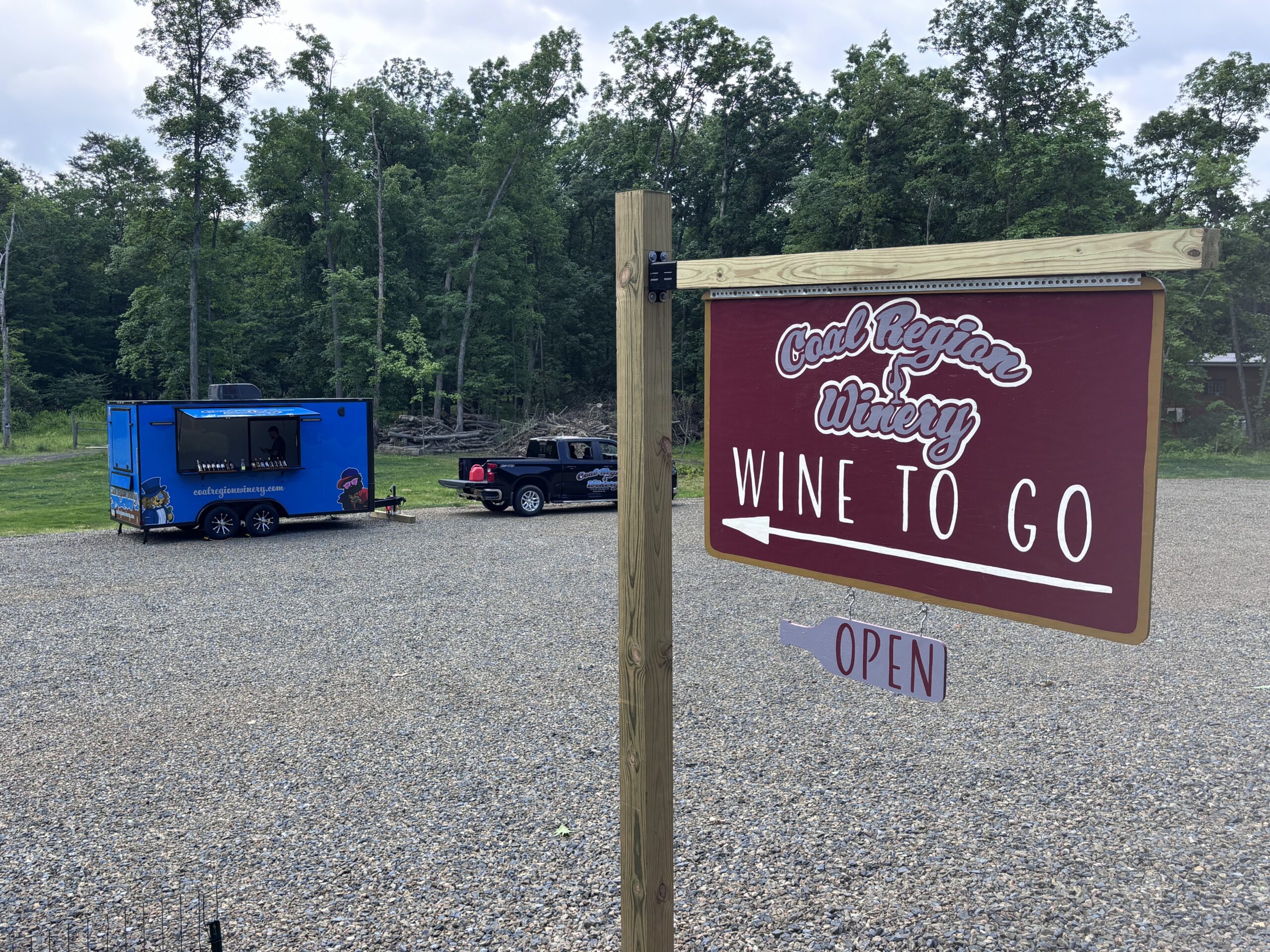
- Hand Painted Signs
- Promotional materials
- Trailer graphics
- Apparel
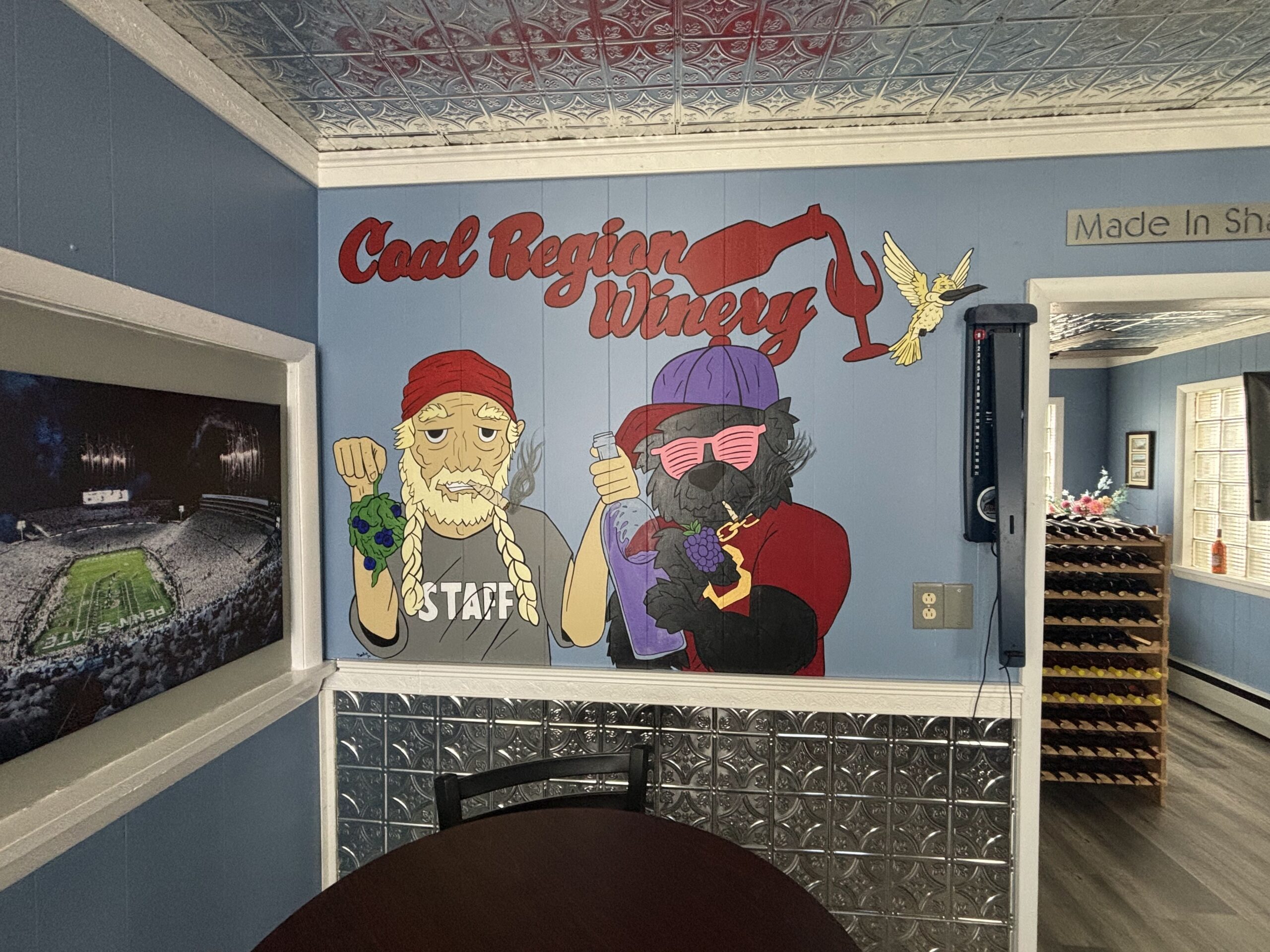
- Murals
Rather than treating each project as an isolated design, every piece contributed to a growing visual language that customers immediately associate with Coal Region Winery.
Results
Three years later, the partnership continues to grow.
The strongest measure of success hasn’t been an award or social media metrics—it’s customer behavior.
According to the client, visitors frequently purchase two bottles of the same wine:
- one to enjoy
- one to keep because they love the artwork
That shift—from packaging being disposable to becoming collectible—was one of the original goals of the project.
The continued expansion of the product line and ongoing design work is another indication that the branding system has been successful and flexible enough to grow alongside the business.
Favorite Pieces
While every label presented its own creative challenge, two stand out.
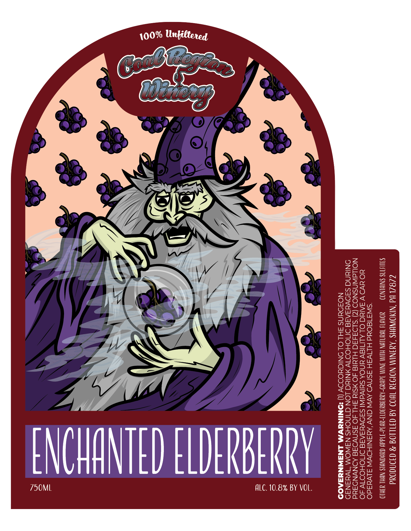
Enchanted Elderberry
This remains my favorite illustration in the collection. It captures the whimsical personality that defines the winery while balancing humor, storytelling, and craftsmanship.
Fore Founder’s Reserve
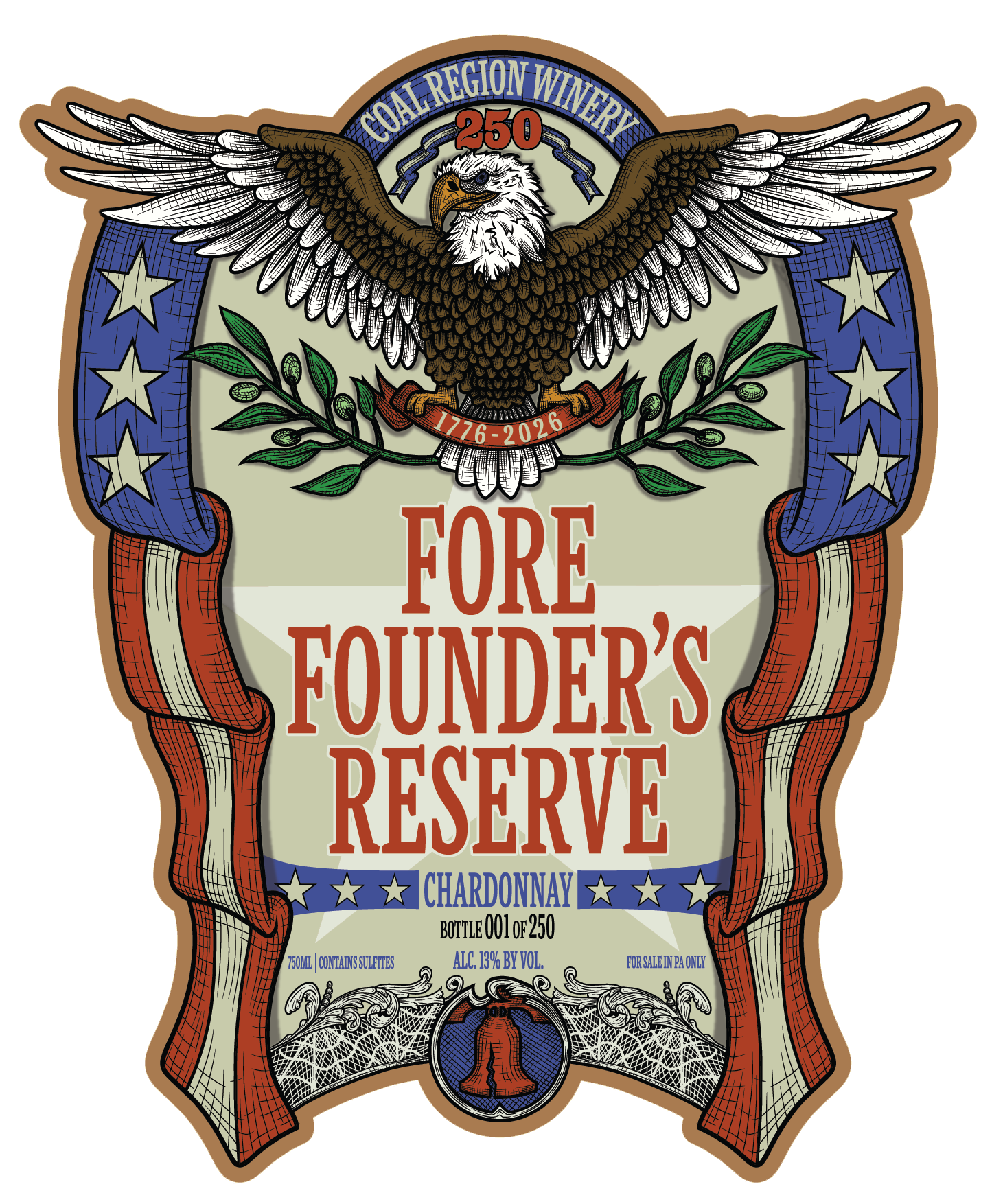
Created for America’s 250th Anniversary, this limited edition release challenged me to create something more historically inspired while remaining unmistakably part of the Coal Region Winery brand. It became one of the most rewarding pieces in the project because of its significance and the level of detail involved.
What I Learned
The biggest lesson from this project wasn’t about illustration.
It was about building a brand with enough personality to grow.
Creating one successful label is difficult.
Creating a system that continues expanding three years later—while meeting customer expectations and keeping every new release fresh—requires consistency, restraint, and a willingness to evolve without losing the brand’s identity.